
What Is a Cash Flow Dashboard?
A cash flow dashboard is a single live view of a business’s cash position, inflows, outflows, and runway, built for the decisions finance leaders make in real time. It consolidates bank balances, receivables, payables, and burn into one display so the CFO, VP of Finance, or FP&A lead can act on capital allocation, hiring, vendor negotiation, covenant compliance, and fundraising timing without opening a second tab.
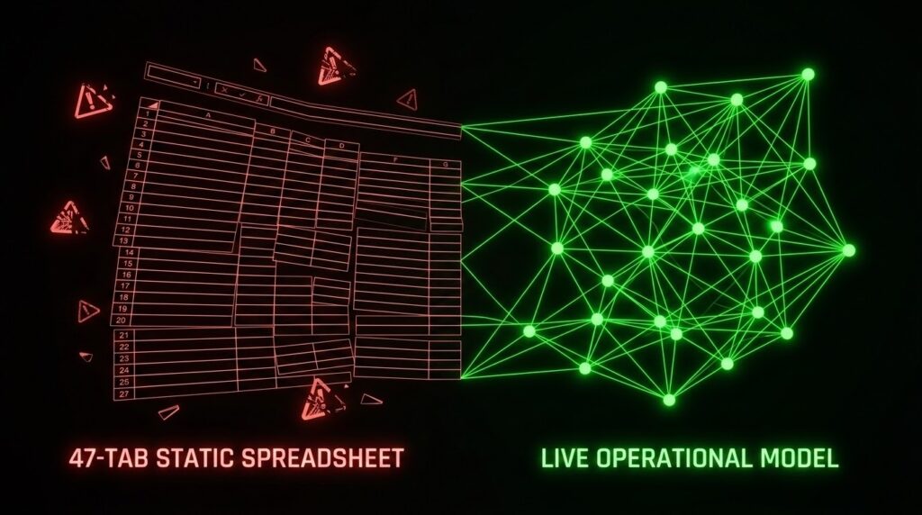
Most cash flow dashboards cannot do this. They are static PDFs rebuilt from 30-day-old exports, or 47-tab spreadsheets locked inside one analyst’s head. The consumers of the dashboard (board members, PE sponsors, CEOs, lenders, the CRO) expect real-time answers. The producers of the dashboard (the FP&A lead, the controller, the finance operations manager) know the data underneath is a patchwork of manual pulls.
This guide is the operator’s case against the static cash flow dashboard. It names why most dashboards lie, what a modern one has to show, what AI actually changes, and the shift from dashboards to a live ontology of the business. A new class of tool, Truzer.ai among them, is built for that shift.
Table of Contents
Why Cash Flow Dashboards Matter More in 2026
Three forces made the static cash flow dashboard indefensible in 2026. Lenders stopped accepting month-end reports. Boards stopped accepting “let me take that offline.” Funds stopped accepting 48-hour turnarounds on weekly burn.
Credit tightened around live visibility. 51% of CFOs now rank improving financial forecast accuracy in their top five priorities for 2026, according to Gartner. Lenders want weekly burn, not a month-end summary presented three weeks after close. The CFO who walks in with a PDF walks out with tighter covenants.
Boards expect real-time answers. PE sponsors no longer accept “let me take that offline.” Scenario questions asked at 9 a.m. are expected answered by 9:15. The CFO who cannot answer live is the CFO the sponsor routes around on the next decision.
The fundraising gap doubled. The median gap between a Series A and a Series B stretched from 18 months in 2019 to 31 months in 2024, according to Crunchbase. Founders now spend almost three years proving the business model works, and the dashboard that cannot show weekly burn and runway in real time extends the raise further. CB Insights tracked 431 VC-backed startups that publicly shut down since 2023 and found 70% ran out of capital before the next round. Every one of them had a dashboard that lagged reality.
Why Most Cash Flow Dashboards Lie
Most cash flow dashboards are not wrong because the math is wrong. They are wrong because the data feeding them is stale, fragmented, and locked inside one analyst’s head. A 2025 survey of finance leaders found 40% do not trust their own data, and 55% do not update their forecasts when new information arrives.
The dashboard the CFO presents to the board is, statistically, a dashboard the CFO does not trust.
The 30-day data lag. Traditional accounting closes monthly. By the time the dashboard reflects last month’s numbers, leadership has already made two weeks of capital decisions on outdated reality. A cash flow chart that visualizes January’s cash when February is half over is decoration, not instrumentation.
Scenarios that take days, not seconds. The board asks what happens to runway if the next round slips by a quarter. The dashboard takes two days to answer. By the time the answer arrives, the board has moved on and the finance team has lost credibility.
Accrual masquerading as cash. The dashboard shows recognized MRR as if it were cash in hand. The business looks healthy on paper and is collecting two-thirds of that in the bank. A dashboard that confuses recognized revenue with cleared cash misstates runway by months. The CFO finds it the day a $400K invoice clears and the runway line does not move, because the dashboard already counted that revenue nine weeks ago. Reliable cash flow forecasting depends on the distinction between booked revenue and banked cash.
Key-person risk. The dashboard is one analyst’s custom spreadsheet with undocumented macros. When that analyst leaves, the dashboard stops working. The finance function goes dark mid-close. The new controller opens column AQ on a Monday, finds a macro written by someone who no longer works there, and the Tuesday forecast slips by a week.
The boardroom ambush. The PE sponsor asks one question on the quarterly call. “What if our top customer delays 60 days?” The CFO opens the dashboard. It is a 47-tab Excel model. Running the scenario takes two days. By the time the answer arrives, the sponsor has made the decision without it. A dashboard that cannot answer the scenario in the meeting is not a dashboard. It is a report in costume.
A dashboard inherits the honesty of its data. Stale data, stale dashboard. The fix is not a better chart. It is a live, unified model of the operation, updating the moment a transaction clears.
What a Modern Cash Flow Dashboard Must Show
A great cash flow dashboard is not a prettier spreadsheet. It is an instrument built to answer seven questions every finance leader has to answer every week.
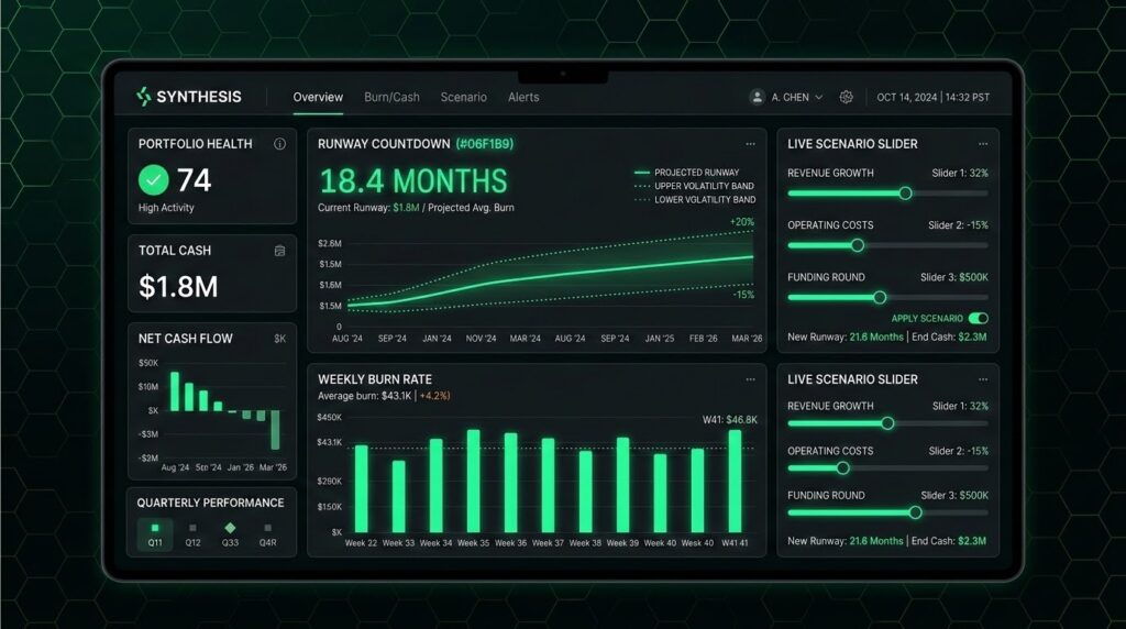
1. Live Cash Position by Bank Account
Not a daily export. Not a month-end snapshot. The actual consolidated balance across every operating account, updated the moment a transaction clears. Without it, the CFO approves a vendor payment on Monday that would have failed Friday’s cash test.
2. Weekly Burn Rate, 13-Week Horizon
Burn broken into fixed operating cost and variable spend. Visualized as a weekly bar, not a smoothed monthly average. Monthly averages hide the weeks where cash dips below the minimum operating balance. The CFO who plans off a smoothed average walks into a week 7 cash crunch that the monthly view never showed.
3. Runway Countdown With Volatility Bands
Not a single number. A central estimate with a band that reflects DSO variance and pipeline risk. A runway of “9 months” with a 2-month downside is a different decision than “9 months” flat. Without the band, the hiring pause that should have started in month 3 starts in month 7.
4. Receipts vs Expected, by Customer
The top ten customers by receipts, with expected-vs-actual collection timing. Flags the enterprise client on day 42 of a net-30 term. This is where surprise cash crunches get caught before they become crises. Without it, the $400K invoice that slipped 30 days shows up as a runway surprise the week payroll is due.
5. Category-Level Outflow Breakdown
Payroll, rent, vendor payables, tax, debt service, capex, one-time events. Each in its own row, not buried inside “operating expenses.” A single “opex” line is a board question waiting to happen. The CFO gets asked to break it out live and cannot. That is a five-minute meeting.
6. Scenario Sliders for Real-Time What-If
Adjust hiring plan, customer delay assumption, or price change. The runway recalculates in real time. If a scenario takes two days to run, it is not a dashboard. It is a report. The CFO who cannot run the scenario live loses the room the moment the sponsor asks.
7. Alerts When Thresholds Break
The dashboard should tell the CFO when something breaks, not wait to be asked. Runway drops below six months. DSO spikes beyond norm. A single vendor payment lands outside expected cadence. The CFO gets told. Nobody logs in to find out. The dashboard that waits to be checked is the dashboard that misses the covenant breach by four days.
A cash flow analysis dashboard that answers these seven questions in real time replaces the 47-tab spreadsheet. One that answers fewer is a report in costume.
Cash Flow Dashboard Templates: Excel vs Modern Tools
The cash flow dashboard template had a good 15-year run. Gartner just called its time of death.
The spreadsheet era is closing on a date. Gartner projects 70% of finance organizations will have moved away from spreadsheets as their primary planning tool by 2026. Gartner’s guidance to CFOs is blunt: 2025 is the last year any serious finance function should budget in spreadsheets. The category has decided. The teams still running on templates are running on a clock.
Why templates stayed dominant. Familiar. Cheap. Every finance team knows Excel or Google Sheets. A well-built template with conditional formatting and basic charts stretched far enough for a stable single-entity business with one excellent controller. Most free templates on the internet (Smartsheet, HubSpot, SCORE) land in that tier. For a business with board exposure, lender covenants, or more than one entity, that tier stopped being enough three years ago.
Where templates break. Multi-entity consolidation. Multi-currency. Scenario modeling beyond three static columns. Live data feeds. Audit trails. Version control across a distributed finance team. The moment any of those enter the picture, the template becomes a liability. The signal it has broken: the FP&A lead spends Sunday night rebuilding the same model the board will see Monday morning. A team spending more time maintaining the spreadsheet than deciding on its output has outgrown the tool. Understanding cash runway in that environment means trusting a number nobody can fully audit.
What modern tools do differently. They pull transactions directly from bank APIs, accounting systems, and payroll systems. They track every input to its source. They run scenarios without rebuilding the sheet. They send alerts when thresholds break. The template is not the answer. A live model of the operation is the answer. The rest of this guide is about what that looks like.
The CFO Dashboard: Reading the Cash Flow Dashboard in Context
A CFO dashboard is the top-level view of a business’s financial operations. It includes cash flow, profit and loss, working capital, burn rate, runway, revenue attainment, and variance to plan. Cash flow is the module the CFO opens first. Every quarter is the volatile one now.
The P&L tells you if the business is profitable on paper. The cash flow dashboard tells you if the business is solvent in practice. When the board asks a scenario question, the question is almost always about cash, not about accrued revenue. The liquidity dashboard extends this view further by adding credit lines, marketable securities, and access-to-capital metrics. For the operating CFO at a 50-to-500-person business, the cash flow module is the decision layer.
The rest of the CFO dashboard wraps that core. Revenue attainment vs plan. Gross margin trend. Working capital ratio. Covenant compliance flags. Each module feeds another: cash flow feeds runway, P&L feeds variance, working capital feeds the credit negotiation. Pull the live cash flow module out and the rest of the CFO dashboard is a scorecard without the score.
AI Cash Flow Dashboards: What They Actually Change
AI cash flow dashboards are not the fix. The data underneath is the fix. Every CFO knows AI is coming. Whether it helps or humiliates depends on what it is running on.
Where does AI genuinely help a cash flow dashboard?
Anomaly detection on transaction streams (“why did this week’s payroll run $14K higher?”). Pattern detection in collection behavior by customer segment. Scenario generation at speed: three branching outcomes before the board call instead of one static number. Plain-English queries (“show me every customer who has slipped past net-30 this quarter”). Deloitte’s Q4 2025 CFO Signals survey found 87% of CFOs believe AI will be extremely or very important to their finance department’s operations in 2026. The adoption is real. The question is whether the data underneath the AI is real.
Where does AI quietly make things worse?
AI cannot fix stale inputs. AI cannot categorize a transaction the accounting system has not captured yet. AI cannot predict a lost contract it has no signal about. Gartner’s 2025 CFO survey found only 36% of CFOs feel confident in their ability to drive enterprise AI impact, and the gap traces back to the same root cause every time. The core problem in the legacy finance stack is data freshness, not model sophistication. When AI runs on monthly exports, it gives confident answers to questions the data cannot support.
What has to be true before AI helps?
Live, clean, integrated operating data. Every bank transaction, invoice, expense, contract, and payroll run mapped to a single live structure the AI can reason over. That structure is the ontology. The next section is about it. Without it, AI dashboards guess faster.
What is the operator’s decision rule for AI cash flow dashboards?
If your finance data lives in fewer than three systems and reconciles itself daily, AI dashboards will sharpen the decisions you already make. If it lives in seven or more and reconciles monthly, AI makes the lie faster and more confident. Fix the foundation first. The AI is the last mile, not the first.
The Dashboard Era Is Over. The Ontology Era Has Started.
The cash flow dashboard, as the category knows it, was built for a world that no longer exists. Monthly closes were fast enough. One analyst could hold the model in their head. Boards waited until the next meeting for the answer. None of those conditions survive in 2026.
What ends the dashboard era. Three forces, arriving at once. Boards want answers inside the meeting, not after it. Data volume exceeds what any human can reconcile manually. AI exposes every stale input as a confidently wrong answer. Thirty-day-old data. Thirty-second question. Two-day recalculation. That is not a tool. It is a liability the operator stopped being able to afford.
What starts the ontology era. A live, unified digital twin of the business. The ontology. Same thing. Every bank account, invoice, contract, expense, payroll run, and operational event mapped to a single structure that updates as the business moves. The dashboard becomes an output of the ontology, not the center of the stack. The CFO no longer reads a dashboard. The CFO queries the ontology. Yesterday’s intelligence was a static view of yesterday. Today’s intelligence is a live model of today.

The tools built for the ontology era look different. They connect to the systems the business already runs. They build the data structure themselves instead of asking the finance team to maintain it. They ground every AI answer in the ontology, not in generic training data. They send the CFO the answer before the question is asked. The cash flow dashboard inside that stack is no longer a 47-tab model. It is a query against a live model of the operation.
This is the category that replaces the static dashboard stack. Truzer.ai is the AI integrator built inside it. The next section is how it works on cash flow specifically.
How Truzer.ai Approaches the Cash Flow Dashboard
Truzer.ai starts from a different premise than every legacy BI and FP&A tool on the market. The ontology creates itself. The dashboard is an output of it, not the reason it exists.
How it works. Point Truzer at a bank, accounting, payroll, and ERP source. In under 60 seconds, the live digital twin of the business, which Truzer calls the ontology, builds itself. Every transaction, invoice, expense, contract, and payroll run maps to it in real time. The dashboard renders off the ontology, not off a 30-day-old export. AI is grounded in the ontology, not in generic training data.
Deployment. 48 hours from first connector to live control tower. Truzer connects to existing bank, accounting (QuickBooks, Xero), ERP (NetSuite, SAP, Oracle), payroll, and operational data sources, including Foundry-native deployment paths. No rip-and-replace. AES-256 at rest, TLS 1.3 in transit, scoped tokens, isolated AI inference, zero external API calls.
Transparent pricing. $2,000 per month for unlimited AI inference. $9,000 per node per month for full AI integration. Zero vendor lock-in. Most competitors will not show a number.
The thesis is simple. A cash flow dashboard grounded in a live ontology is structurally more honest than one rebuilt from last month’s export. Truzer is a new entrant. The argument is older than the company. Every other dashboard shows what happened. The ontology shows what is happening.